Lady Derm Docs

Website Upgrade and Brand Development

We are so excited about the debut of our new website! Thank you to our extraordinary Webmaster, @kennethfeldman, for his creativity, wisdom, brilliance and patience.

Ladydermdocs (on Instagram)

Baltimore dermatologists Dr. Eva Simmons-O’Brien and Dr. Diane Orlinsky wanted to update their ten year old website. Besides the obvious visual update it needed, I recommended that we update all of the written information first. The website had the basic sections, including bios of the doctors and the primary staff. But the services pages were filled with a minimum of info, mostly in the form of bullet points.

However, what I found missing, was any information about the practice itself. What was their medical philosophy? What kind of patients do they see? Is there anything different or special about their practice or their partnership? How could anyone tell if this was the right practice for them?

We conducted a long interview with both doctors, and found them both to be amazing women, accomplished doctors, dedicated healers, and committed to providing the best possible and most comprehensive healthcare to their patients. Yet, none of that passion or mission was contained in their online materials.

Our lead writer Samara did a wonderful job of distilling and presenting the story of this practice, and what the doctors come to work to do every day.

Now, instead of simply providing the boring facts of the practice (location, hours, list of treatments, etc.), the website conveys the passion and dedication the doctors provide to their patients. And more importantly, the website shares the promise that the doctors make everyday to every patient;

“We promise to empower you in your own healthcare journey, so you know with confidence that you have the support and resources you need to be healthy and happy in your skin.”

Who wouldn’t want to be their patient!

Now, all that goodness is wrapped in a clean, fresh, simple layout, and is topped off with a bright new logo!

Visit the Lady Derm Docs Website

New Logo Design
Re-designed homepage
Old Website

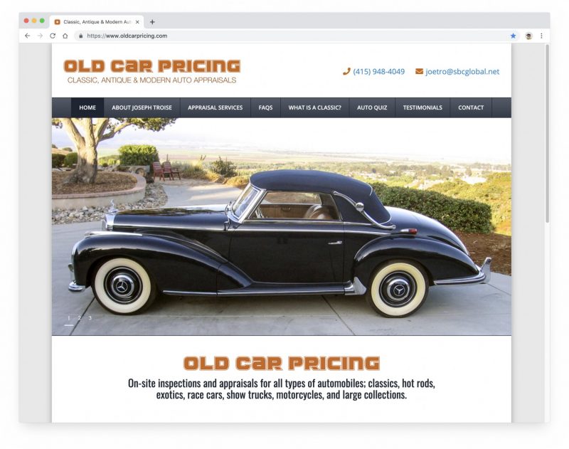
Old Car Pricing

Excited to announce the launch of a complete website redesign and rebuild for classic automobile appraiser Joe Troise, at Old Car Pricing.

This website was originally made almost 20 years ago! At the time it was as modern a website as there was, and it has served Joe very well for many years.

Fast-forward to mid-2019 and the site needed an upgrade. It was very text heavy and the navigation was all wonky. The information in the website was actually very good — and besides just updating some facts, we did not change the basic text and info.

BUT what we did do, was to ORGANIZE and LABEL it all much better! Now it’s super easy to tell what Joe does and how his services work.

Then we added a bunch of crisp photos of classic cars and hot rods and gave the website a new logo and a clean modern/retro automotive vibe. We kept the old orange color by putting it in the logo an accent colors of the new website. Now all of the pages clearly display and emphasize Joe’s deep expertise and experience.

You can rest easy buying or insuring a classic/collectible car when you are backed by a professional appraisal from Joe Troise!

After the 2019 Redesign
Before the 2019 Redesign
Facebook Social Sharing Image
New Logo

Visit OLD CAR PRICING

Insta-Ken Pix

For the Insta-Ken website project, I became my own client!

As an artist, my Instagram collection is the living documentary of where I go and what I see. So I decided to make a gallery website and shop where visitors can view my work, and maybe purchase a print for their own art collection.

The website is clean and simple, letting the art take center stage. The shop is powered by a customized installation of WooCommerce, allowing buyers to purchase the artwork securely via credit card. Ordering information, policies, and print care information round out the great information provided to potential buyers.

The main goals of the website project were to make the gallery and sales process feel professional, trustworthy, and reliable.

www.insta-ken.com

Read the rest of this article »

The Cocktail Guru

Raise your glasses for some holiday cheer! It’s another new website launched here at KPFdigital.

The Cocktail Guru website needed a fresh new look, and we think we nailed it. (We, is me and fab visual designer Michael Kroll.)

Jonathan Pogash and his Cocktail Guru team develop delicious and on-trend cocktail and beverage programs for bars and restaurants. They also offer fabulous team building events crafted around cocktails and mixology lessons. Visit the new Cocktail Guru website to learn more!

Visit The Cocktail Guru website »

Victoria Sweet MD

We just completed a total website redesign for physician, author, historian, Victoria Sweet MD.

And it’s just in time for today’s release of her new book, “Slow Medicine, The Way to Healing.”

Dr. Sweet wanted a clean, simple, and gentle looking website — which would match her concept of slow, careful, personal healthcare.

But she also wanted the backend of the website to be just as slow and hands-on.

This was an interesting challenge, because nowadays, websites can be quite automated and high tech behind the scenes.

And so instead of creating lots of automatic or automated features inside the website, we made it easy for her to manually, and easily, craft all of her content and information.

Now she has a website she can spend time with manually, and really feel what’s happening everywhere inside.

This makes total sense for a writer! And it also makes sense for a doctor who practices… Slow Medicine.

Visit Website

Vendome Press

We’ve just completed a total redesign for book publisher VENDOME PRESS. Earlier in the year, we completely rebuilt the framework and backend of this website to make it easier for Vendome staff to manage and update their book catalog.

Now, in phase two, we’ve applied a new 2017 branding to the frontend of the website, while retaining all of the really neat stuff we built for the backend. New brand look developed by fabulous design firm Charles and Thorn of Brooklyn, NY.

Visit the Vendome Press website »

Example of Custom Book Info Edit Screen:

Unnata Aerial Yoga

AerialYoga-Three-Devices2

Just launched a total redesign for Michelle Dortignac’s Unnata Aerial Yoga website. This is my most favorite website that I’ve ever made!

The whole site is designed to be ultra iPad/mobile-friendly first — while still looking great on full sized devices.

Layout, concept, and overall design approach is from me — but the exact design and design elements/details are by my fabulous designer Michael Kroll.

Writing and branding concepts by Michelle and Samara Taylor, logo by Peter Levine, gorgeous images by Finnish photographer Nina Merikallio.

Visit the Unnata Aerial Yoga website »

Pinnacle Trust Partners

Pinnacle-Three-Devices

Pinnacle Trust Partners was seeking a design upgrade — where the existing design elements would remain, while a newer, sharper image was created. KPFdigital created a new design, featuring numerous, carefully curated high quality stock images which represent the various high tech infrastructure projects that Pinnacle works on. Additionally, the new website is fully responsive to any device it’s viewed on, and the website is fully self-manageable by the Pinnacle team.

Visit the Pinnacle Trust Partners website »

Gem Lab

The Gemological Laboratory of America (Gem Lab) needed a total makeover of their old website. Originally created over 10 years ago, albeit early to the website world, it was now sorely out of date, and Gem Lab manager Josh Lents could not update the website at all.

http_www.gemlab.comKPFdigital worked with Gem Lab to create a totally new, professional looking website, which was completely refocused to emphasize Gem Lab’s unique appraisal laboratory services.

While the old website had much of the same info, it was so cluttered that it was too hard to find the most important information; their services descriptions and location. And the search engine ranking were not great.

A few months after the launch of the new website, Gem Lab let us know that their call volume had increased substantially! But more importantly, the people weren’t calling just to check out Gem Lab’s credentials, or asking for the location. They were calling for only one thing: To make an appointment.

The new website was now doing a fantastic job of communicating Gem Lab’s reputation and quality, explaining exactly what their services are, and the site now conveyed a sense of authority and trust. By the time customers made the call for an appointment, all of the important questions had been answered by the website. The only thing left was to go ahead and make the appointment.

Oh, and the solid Search Optimization features that we added have made a huge difference. Take a look at the Google results for the search term “Diamond Appraiser NYC.”

Additional Features

Visit the Gem Lab website »